Brand
Refresh

EQ Bank, Canada’s first digital bank, needed to modernize its branding for a growing consumer base.
Graphic Design
//
Motion Design
//
Video Editing
//
Creative Management
//
UI Design
//
Graphic Design // Motion Design // Video Editing // Creative Management // UI Design //
Balancing day-to-day operations with a massive corporate rebrand required tight project management and cross-functional synergy. Working closely with the creative director, we developed three distinct mood boards to pitch to the executive leadership team.
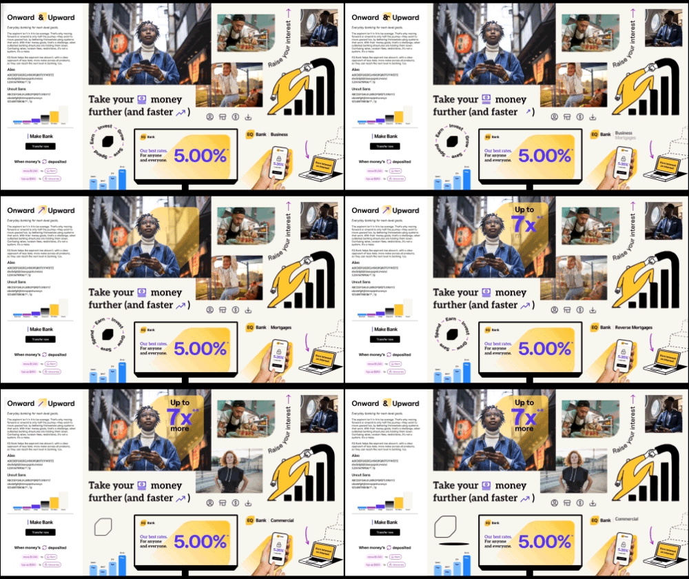
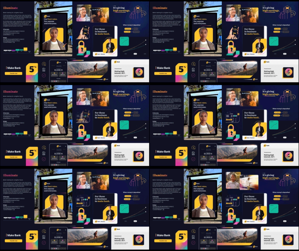
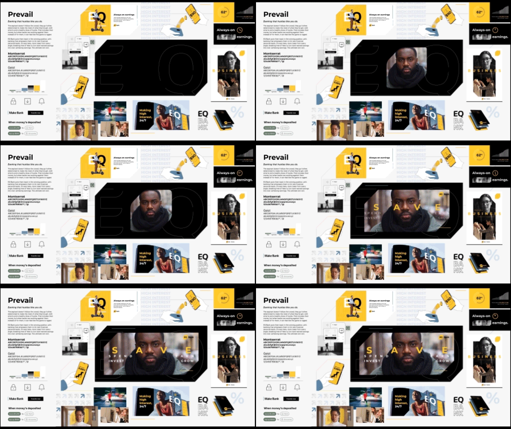

Once leadership selected the warm, modern editorial direction, the team moved into formalizing typography and colour systems.
Following a competitive analysis of the Canadian banking landscape—where blues, reds, and greens heavily dominate—we leveraged complementary colour theory to mature the brand’s palette, transitioning from a juvenile yellow and pink to a sophisticated yellow and indigo pairing.
To solve an internal pain point regarding an over-reliance on stock photography, we commissioned a Canadian illustrator to build a custom, proprietary library of human-centric illustrations and objects optimized for web, app, and ad placements.

Following the initial brand rollout, our refresh team collaborated directly with developers to completely overhaul the public-facing website. The year-long undertaking stands as a milestone project, successfully elevating EQ Bank’s digital presence and creating a cohesive, human-centred brand experience for clients nationwide.